
room review, number two
I have been filming a campaign for a furniture brand all week. It's a new format, longer videos and higher production than I typically do, and I am really excited to take it live! I haven't had time to do anything else.
Here is a room review from an audience submission:
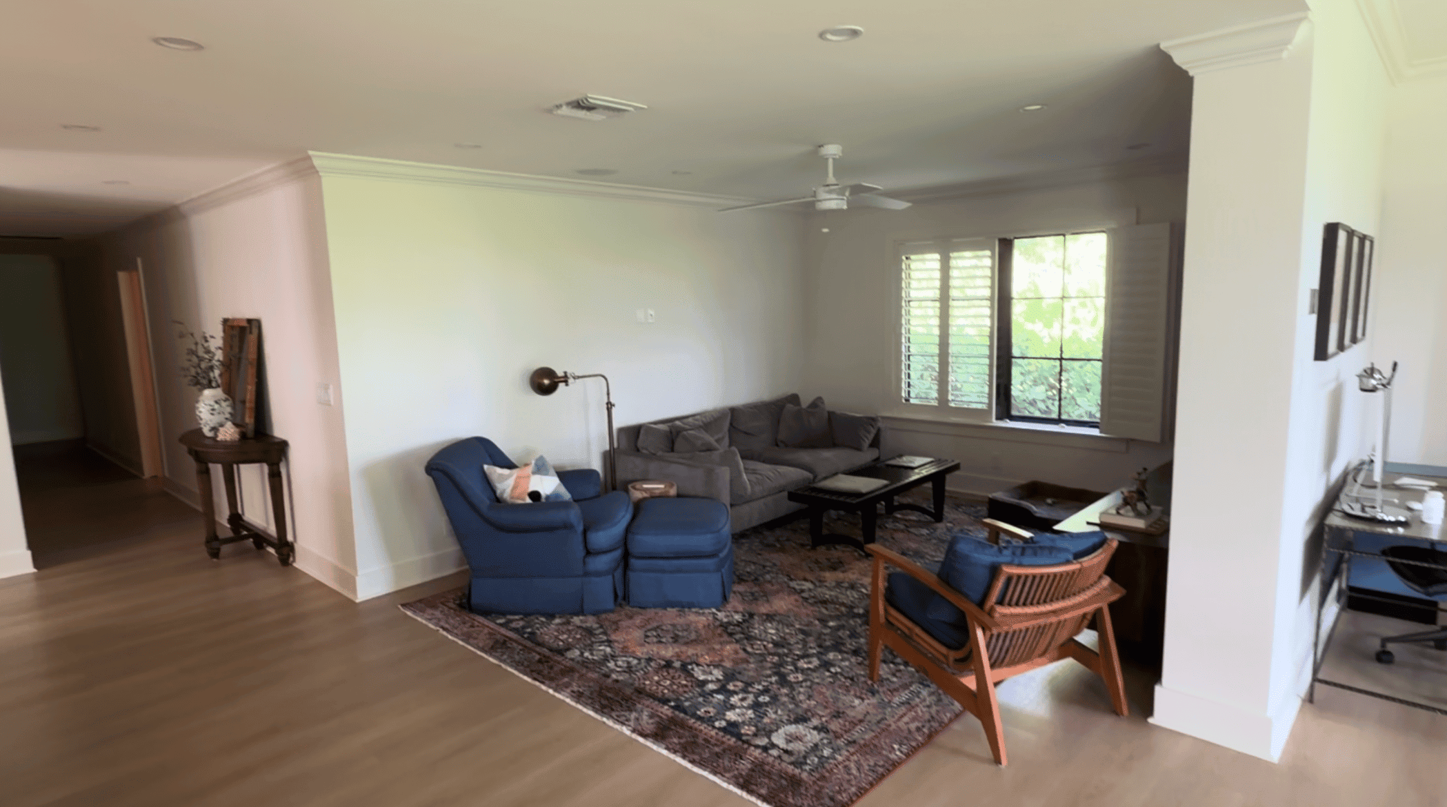
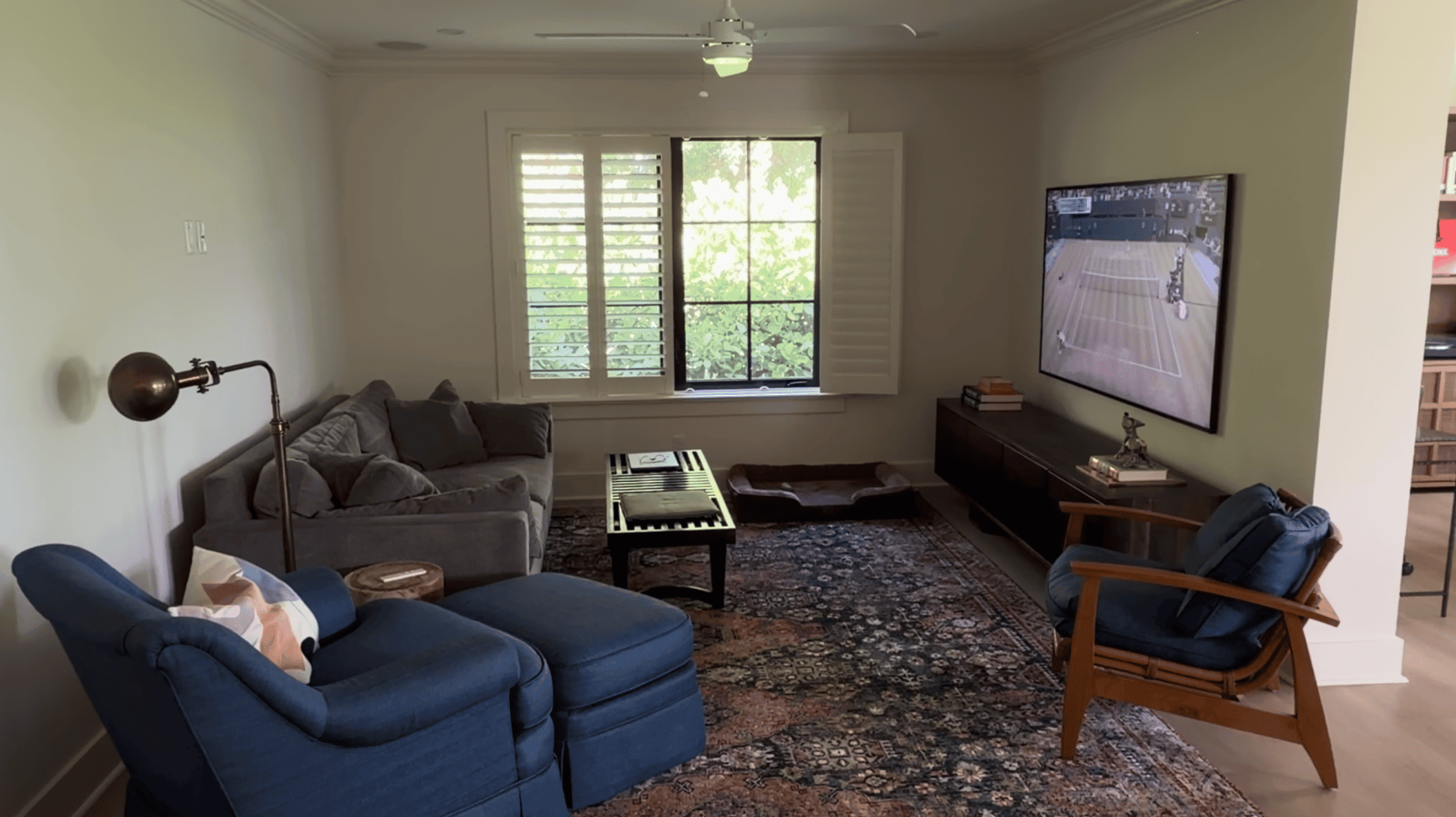
What I like:
-The reading lamp is a 10/10
-I love that the TV is tucked away; this setup is ideal. The console under the TV is perfectly sized
-The blue chair with the ottoman is beautiful; unfortunately, I don't think we can keep it
-The rug is nice with the blue furniture, and I love the window
What's wrong:
-The gray sofa is too small for the wall and doesn't really go with the rest of the room
-The coffee table gets lost
-Everything is on a low plane; there is not enough height and no skyline. The only thing on the walls is the TV
How I would fix it:
-In honor of that wonderful blue ottoman chair we need to get rid of, we're going to do a navy sofa in a fun shape. This could also be a chaise sectional if you prefer that - I'd have the chaise portion under the window.
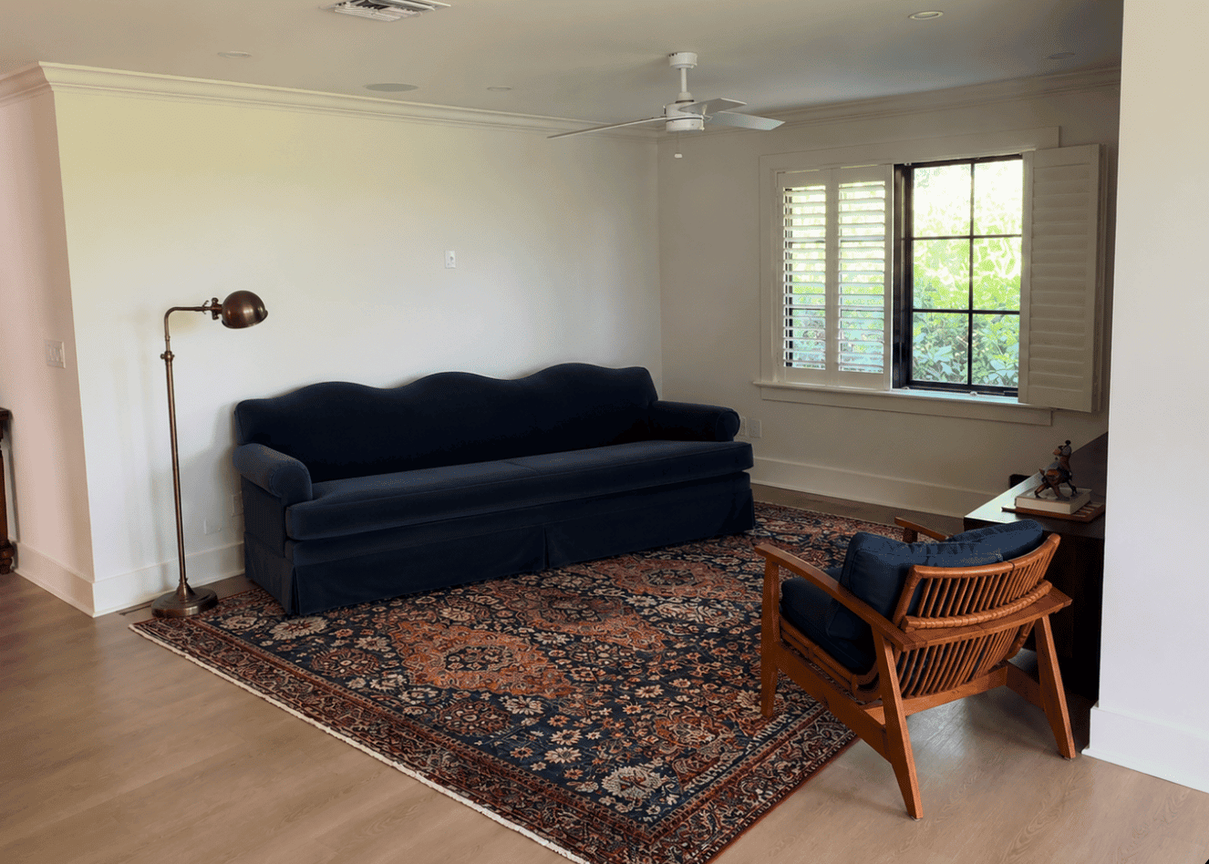
Image generator cocked this sofa to the side a little bit, use your imagination
-Then we would add in a coffee table whose darker legs match the TV console with a creamy marble top that doesn't get lost in the rug
-a wood side table in a similar acorn finish as our rattan chair
-art over top of the sofa
-a small creamy ottoman
-that window is really nice, and we'll frame it with sconces on either side. Kind of an unorthodox sconce placement, but I bet the light would be really nice at night.
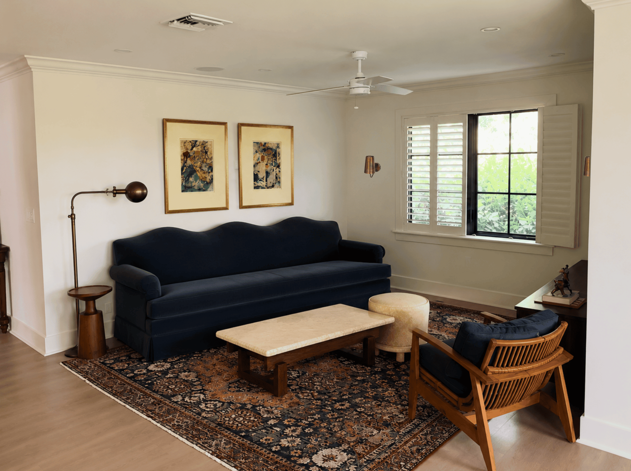
This models are still a little clunky - chair should be pulled towards the corner of the rug but other than that, this is pretty good
Shorty this week given the filming schedule, hopefully still a goodie!
