
good rules die hard
I recently watched Die Hard for the first time in a while, as one does. I love old movies - the way they feel, the sets. There's much to appreciate design-wise from the late 80's.
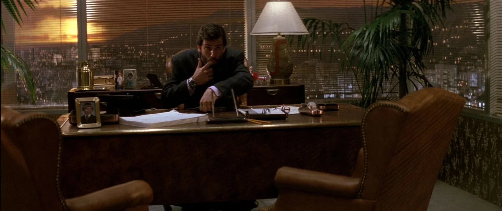
The aluminum blinds, especially. It's such a look throughout the film.
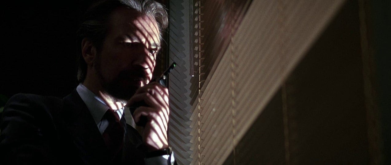
Hans Gruber!
There's also glossy cherry wood paneling, sunken floors, stone facades, and, of course, huge plants and statues, either uplit or spotlighted. It's that quintessential 80's Hollywood version of Asian glam meets power lunch, and I don't think you could quite get away with it today.
But certainly worth distilling and learning from.
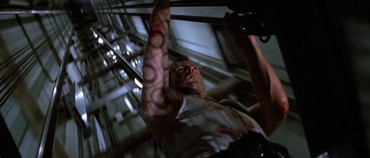
The warmth and mood of the office suite is a great compliment to the cold, sleek postmodernist industrialism of the rest of the building, through which Bruce Willis runs, crawls, and dodges innumerable bullets.
I appreciate the metal control panels at the concierge desk and elevator. Today, all of that would be touchscreens. There's something sophisticated about metal panels and real buttons. I think part of the reason higher-end metal light switches are gaining popularity again is that they have a wonderful, tactile analog quality we subconsciously miss in the age of the iPhone and car screens.
If you wanted to create a design formula for the Die Hard aesthetic, it might be aluminum blinds + large plants + spotlight lighting + reddish wood paneling + concrete and steel walls + metal panels with buttons.
Very nostalgic, very vibey.
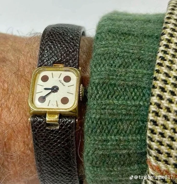
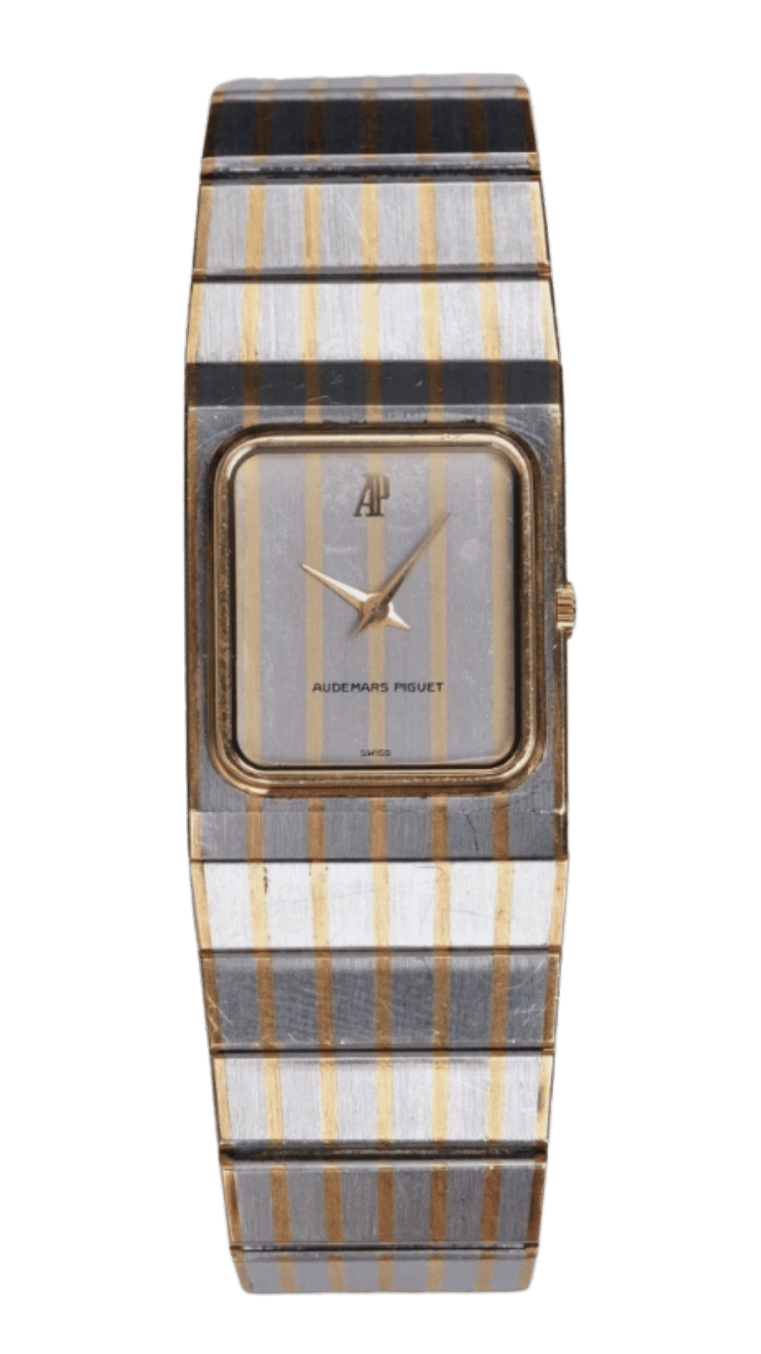
Speaking of nostalgia, I've also been on a deep vintage watch kick on Pinterest. I am really not a watch guy, but one popped up that totally struck me, and the algorithm did its thing. Suddenly, I'm saving dozens of them, I can't help myself. So much good stuff over the years.
After I had saved about 30, I started to ask myself, what makes a watch look great?
It took a while, but I realized what I actually really like is when the face is integrated seamlessly into the band. There's no interruption, just one continuous form. Maybe the face contrasts with the rest of the brand, but the bracelet shape remains essentially intact.
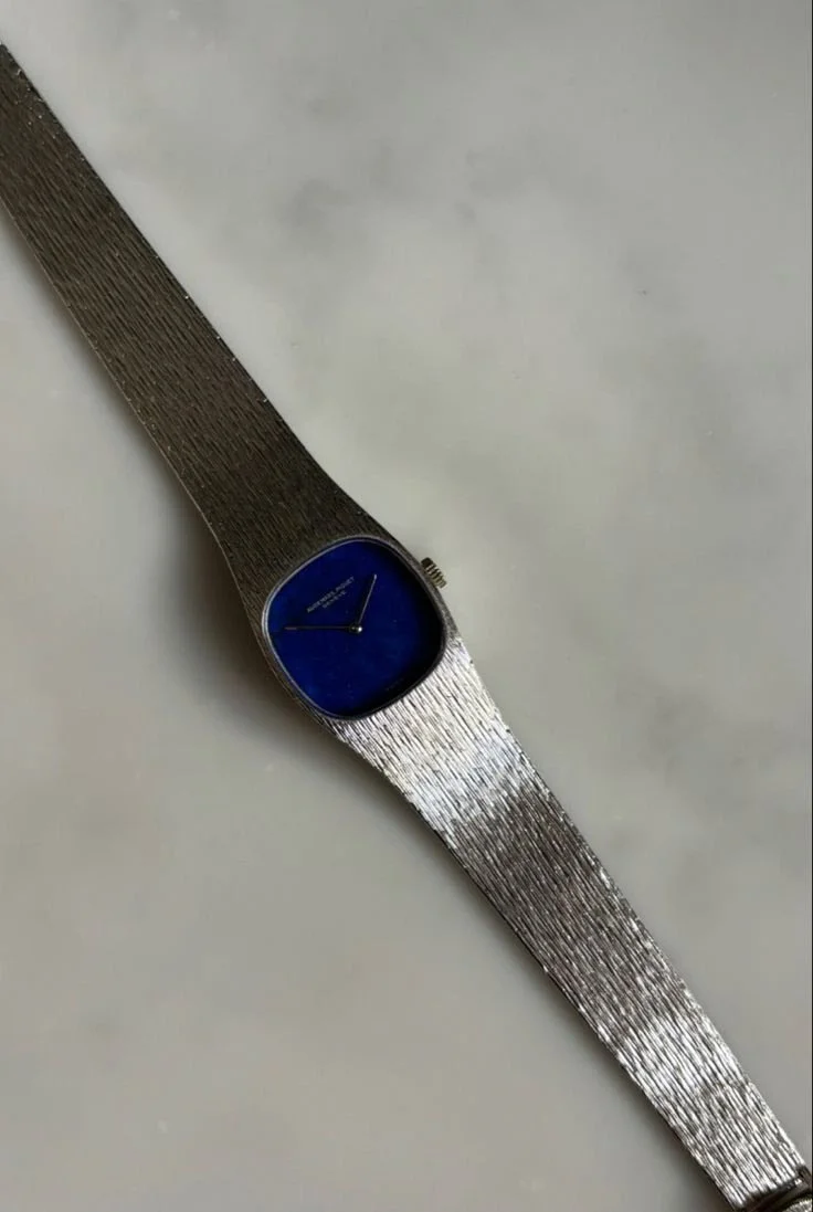
All of a sudden, I've got kind of a "rule" for what makes a great-looking watch, at least according to Hans.
I've been on a journey for the better part of a decade to answer this question: What makes something look good? Whether it's a living room, an apartment building facade, a light fixture, or a garden.
Can we reverse-engineer it? Are there simple rules or a formula?
This is a really fun way to approach design - find your rules. Almost like an equation for a room. It also forces you to really analyze and get specific about what moves the needle.
A few good rules I've collected over the years for interiors are:
Same-height seating. Ian Schrager used to cut the legs off hotel beds, so they'd be the same height as the coffee table and low sofas. When all your seating in a room is roughly the same height and depth, it creates this incredibly cohesive conversational pocket. I did this in our playroom - removed the feet from a modular Pottery Barn kids sofa so it matched the height of a Nugget and coffee table. It just works.
Nothing smaller than a cantaloupe. Go through your house and remove every decorative object smaller than a cantaloupe. What's left will feel more substantial, more serious. Less visual clutter, more weight.
Dense landscaping over neat rows. Forget evenly spaced plants in rows. Mass things together densely - just a few plant varieties repeated across your whole property in thick clusters. It looks much more like nature than a grid.

Same Kelvin lighting. Walk into any great restaurant, and the lighting temperature is uniform throughout. Walk into many houses, and it's not - ultra-bright kitchen, warm living room, cold bathroom. Having uniform lighting temperature is the move.
Rule of Thirds: The coffee table paired with a sofa should be about 2/3 the width of the sofa. Same with art hung above a sofa or a bed - about 2/3 width of what it's hanging over. Accent chairs paired with a sofa should be about 1/3 the size of the sofa. Furniture should occupy about 2/3 of a room's floor plan, with walkways and open space making up the remaining 1/3. There's inifinity applications to this.
Turn your photo black and white to check for contrast & texture. If a photo of your room is still interesting when you turn it black and white, you're doing good work. If it falls flat, you need more contrast and texture.
I saw the simplest breakdown of rules for men's outfits the other day. Just go for contrast. Dark top, light pants. Light top, dark pants. Dark coat, light shirt. So much of great style comes down to this one simple principle.
Of course, here's the thing about rules - the fun part is knowing when to break them. Where does one rule stop and another begin? When do you loosen cohesion for the sake of interest?
That's the joy of creativity and self-expression. You choose the ones to make and choose the ones to break.
I am curious, what are your favorite design or fashion rules? Or just any rule you have to make things look better that you've discovered along the way. Would love to hear!